From colour separation to trapping: how to adapt files to printing constraints to ensure color rendering, consistency, and repeatability across different outputs.
Choosing between flexography and rotogravure is not only a matter of “printing”: it is a process choice that influences costs, times, variables management and performance expectations. Flexography tends to be the most sensible solution when the packaging market requires frequent updates, many references, medium-short print runs and the need for rapid reaction to the market; on the contrary, rotogravure expresses its maximum value when print runs are longer and repeated, and stability over time and perceived quality – especially on images, gradients and large backgrounds – are a non-negotiable requirement.
In between is the daily reality of brands and converters: same graphic content, but different outputs, with technical constraints that can change substantially. This is when prepress becomes the real checkpoint.
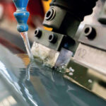
A file that is ‘ correct ‘ for one process is not automatically so for another: ink limits and separation strategies change, as do tone curves and solid ink density, trapping and overprint rules, spot color management, minimum printable dots, repeats, and tolerances.
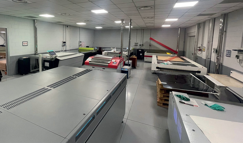
The ability to read these differences and transform them into concrete interventions on the file – without altering the visual identity of the brand – is what separates a simple conversion from a reliable execution. We discussed this with Paolo Ghedini, Managing Director of 2G&P, who addressed this need by integrating two operators with rotogravure prepress experience and expertise in related linearizations into his company, which has specialized in flexography for years.
Analyzing your company’s performance and the requests coming from your customers, what are the main reasons that can convince a client to move production from rotogravure to flexography (and vice versa)?
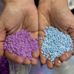
Today flexo is often the choice for sustainability reasons (less emissions/ energy), faster start-ups, less waste and lower costs. Plates and archive management are cheaper and lighter, especially on medium-short print runs. In addition, flexo has improved a lot in quality, with improved speed and better repeatability, the cases in which rotogravure is essential are fewer now.
What are the main technical aspects to pay attention to in this conversion phase?
Results can be maintained, but only by changing the approach. In rotogravure, cells are modulated on the same cylinder; in flexo, each colour has an anilox with a defined ink volume. This calls for different color separations and, sometimes, the introduction of additional colors to manage the areas that cannot be processed within the same volumes.
Very low densities are also common in rotogravure, useful for overlays and shades: in flexo they must be reconstructed by rethinking separations and prepress.
Can you confirm or disprove the trend of many companies aiming at standardization as a crucial goal for business productivity?
I confirm: it increases productivity and predictability, but requires rigorous procedures and constant control. It is easier in pre-press than in the printing phase, where the number of variables increases considerably.
What is your opinion about the adoption of heptacromia? How’s the market reacting?
We have been offering it since 2015, after performing numerous tests with our printing partners, and I consider it very valid: it brings efficiency, quick starts and standardization (the machine is “always ready”, only the set of polymers must be changed). It allows multiple references in the same system, exceeding the available colours.
The main barrier is cultural: it is necessary to accept a standard process and make customers, agencies and graphic designers “accept” colours that do not provide the usual reassurance of a “visible” Pantone. It is a growing technology, but it’s still poorly understood.


