
Ideas and clarifications on the critical aspects of spot color management from the recent Fogra symposium on ECG. A first draught.
The leitmotiv of this year’s Fogra conference was multicolor printing, which we are accustomed to refer to as “hexachrome”. The technical term though is ECG (Extended Color Gamut) though EGP (Extended Gamut Printing) is also used.
[su_box title=”The Author” box_color=”#e6000a” radius=”5″]
 Andrea De Rossi trainer, consultant and researcher. Proposer of integrated solutions for color and packaging. Appreciated problem solver for his ability to analyze and solve the most critical situations for conventional and digital print flows. Member of Fogra for almost 30 years and for 10 years a five stare UCE Ugra Certified Expert. Student of Prof. Pietro Chasseur, Italy’s greatest color, with whom he still studies color and seeks qualitative-economic-sustainable solutions.
[/su_box]
Color and gamut: keywords
ECG The name Extended Color Gamut indicates how one can extend the color range of reproduc ible colors in a printing process by adding spot colors that are possibly monopigmented and therefore pure. These are bases with only one pigment, not mixtures of two or more inks/colorants: a technical aspect linked to the quality of raw materials available and in particular to the purity of inks. Furthermore, the additional color must not already be included in the four-color gamut, as happens for example in ceramics. Usually you add an Orange, a Blue or a Green, but it can also be Violet, Blue Reflex, a warm Red or warm Green. All colors can be easily managed in offset printing processes, where it is normal to have a flat printing machine with 5 and 6 colors, while a 7-color machine is not only rare but also special. The situation in flexography and rotogravure is different. Here the machines have at least 8/10 printing units and therefore an already available printing technology can to be used. EGP As anticipated, the second term EGP indicates the printing technology that enables the extension of the four-color gamut. Digital is also interested in multicolor printing. It has been used for countless years in the printing of fabrics and ceramics, first with screen printing and 6-7 years with digital process. This is not surprising: the decorative sector is obviously interested in solutions that can enhance and enrich the color range. There are three best-known combinations, all supported by a four-color base:
- pentachromy consisting of CMYK + 1 spot color, normally blue;
- hexachromy consisting of CMYK + 2 spot colors, normally orange and blue;
- eptachromy consisting of CMYK + 3 spot colors, normally orange, blue and green;
- octachromy consisting of CMYK+4 spot colors, normally orange, blue, green and a further color as reinforce (i.e. double black) or a metallized one.
In all cases it is a matter of copying a more extensive range of colors than what is offered by the conventional four-color process with ISO 2846-1 (offset printing) and ISO 2846-5 inks (flexo printing). It means going from about 300- 400,000 chromatic compositions offered by the basic four-color process to the approximately 750,000 colors of heptachromy. With a clarification: it will never be possible to completely copy the gamut of an Adobe RGB color space, even if the color expansion exceeds the standard Fogra 39 space by 40%.
An example worth seeing
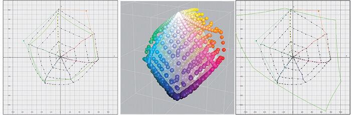 The image on the left of this triptych shows a hexachromy gamut with the addition of two spot colors: orange and green. The blue is expanded a lot thanks to the use of a four-color process extended with Magenta Rhodamine, which has made it possible to obtain powerful blues even without Blue 072. In this case we in fact have a heptachromy rendering using an offset printing machine with 6 printing units. The comparison between the ISO Coatedv2 profile and the multicolor profile is highlighted in green. At the center we can see the three-dimensional gamut with the volume of the Fogra 39 profile in white. On the right you can see how the Adobe RGB color space contains the expansion of the green and blue area but not the warm orange one.
Quality procedures
The topics covered in the Symposium always referred to the Color Management of spot colors and the standards to be followed to ensure a faithful and repeatable color. In fact, the quality of the printed color is the result of a correct procedure applied throughout a workflow – from the creation of the PDF file, to the prepress, to the characterization of the device, the ink and the substrate used. The themes dealt with by the speakers confirm this:
- The management of spot colors through the CxF / X-4;
- The 4-color and multicolour communication and the extended gamut printing (CMYK ++); (heptacromy CMYK +; hexachromy CMYK ++; pentachromy CMYK +++)
- The implementation of multicolor printing in flexo and rotogravure printing;
- High-speed “pure digital” inkjet printing;
- The color test. Accuracy and precision for hardproofing and softprooofing;
- In-line color management systems and control processes;
- The qualitative assessment of color 4.0: beyond color.
[su_box title=”The Fogra Symposium: what it is and who attends it” box_color=”#e6000a” radius=”5″]
 The Color Management Fogra Symposium was held this last end of February (Munich, February 28-March 1), constituting a venue where the main European experts in the sector meet up every two years. It provides an occasion to debate current issues and pinpoint future developments, even if there is no shortage of commercial company presentations. In any case, color is the main course, presented with all its condiments and in all its sauces. No wonder it is now an established fact that users no longer predominate. Sector experts, manufacturers and vendors, consultants, university professors (few though) now prevail. Among the 230 presences from all over Europe not to mention India and the USA, 9 Italians took part. Indeed the proceedings were followed by the exponents of three Italian converting companies – one for corrugated cardboard that already works in digital, one of labels and a printer in the commercial and publishing fields – as well as two manufacturers of solutions for priting a multinational company researcher and myself*. Not bad: in 2016 there were only two of us! It should however be said that the cost of participation is around 1,000 euros and therefore it is not within everyone’s reach. You do not go to the Symposium to discover revolutionary innovations or listen to striking presentations, but to meet people and exchange opinions – in short, to “understand which way the wind is blowing”. Nobody reveals their secrets. Everybody is buttoned up, also because if you open up too much you lose the surprise effect: the competitive advantage, as things are today, lasts roughly a few months and then the competitors quickly catch up with you again.
[/su_box]
A “j’accuse”that came from nowhere
The first talk, by Barry W. Sanel (Diageo), immediately broke the ice with a strong title: “The management of spot colors from design to printing using the CxF/X-4”. With this intervention, Diageo, (leader in the global market of spirits) introduced a new theme: What is Brand Color Management. Why is it important? «Because the advertising agencies, color specifiers, spectrophotometer and photolitho builders, ink manufacturers, printers and component suppliers are «all consistently out of alignment with color strategies and use this confusion to their advantage ». In other words: It creates confusion and is great for business. In short, it is not a question of solving problems, but of exploiting problems to create other ones, and thus continuously feed a perennial chain of new needs to be satisfied. I perfectly agree with this strong statement. It clearly expresses the philosophy of “not explaining anything, merely providing a solution”. And any- way people are ignorant and do not understand. Exactly the opposite of what I have tried to do throughout my life, basing my activity on the formation and dissemination of knowledge. It is the first time in my life that I hear such a strong and powerful “j’accuse”. But do you think it caused a stir? No: we moved quietly on to the next presentation, without questions or reactions from the audience.
4 pillars and 8 infrastructures
What are the pillars of “Brand Color Management”? To meet 4 basic points:
- the color in input: must be defined by means of the “design intent” (where the product is destined for and the display, selling and shelf context);
- the communication: the colors are the goal of the printer (the ability to faithfully copy the color sets the various printers apart);
- the standards: practically implementing the concepts opened and initiated by the ISO standards (we need to know the rules and refer to them in order to guarantee the standard);
- the color in output: deliver only coherent and consistent quality (check the entire run to ensure color compliance and repeatability).
These pillars must be integrated with all the following Color Management infrastructures:
- lighting conditions, which are becoming critical with the advent of LED lights;
- the visual-sensorial response of the operators, but above all of the evaluators in charge of the brand;
- the tools, methods, color measurement systems;
- the language of color and the criterion/evaluation system; CIELAB and dE*;
- Spectral color communication standards using the Color Exchange Format CxF/X-4;
- the standard workflow according to ISO 15930-7;
- The PDF, which must contain the Cxf color reference information, the printing conditions and those of the ink supplier;
- The objective of having a DE 2000 with ZERO deviation + printing tolerance!
“Zero tolerance” quality
The objective referred to in point 8 involves accepting very close tolerances:
- ISO 15339-2: 2013 compliance for gamut* CRPC-6 for primary colors and CRP-5 for secondary colors in packaging, as well as CRP-2 for uncoated corrugated cardboard packaging;
- DHab <2 ° for process and brand colors; · DE2000 <1.5 as print run v ariation;
- DE2000 <1.5 as substrate variation and deviation;
- Metamerism index <1.0: what goes beyond the color response under D50 (but with DE 2000 <1.5) for illuminants A, C and F11.
* CRPC (Characterization Reference Printing Condition) or the LUT (Look-Up Table) color table defines the relationships between the CMYK values of the device and the color to be reproduced. 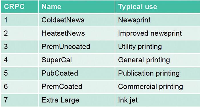
From words to numbers (forgetting the viewing)
From the aforementioned pre-requisites it is clearly understood that the color is no longer spoken, but described digitally. All is based on numbers. As if the numbers were the only criteria of evaluation to guarantee quality, forgetting color perception, color appearance the lightness constancy. These are three attributes of color perception that are closely related to the non instrumental evaluation criteria of those who judge the print: the paying customer, better considered as the standard observer. A pity that nothing was said about the perceived and appreciated color…
The software: performance and limits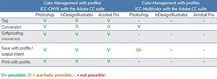 A critical aspect of multicolor management is represented by Adobe CC applications that manage the CMYK color model almost without limitations, while they show great limitations in the management of multicolor profiles. In particular Photoshop does not handle multicolor softproofing. It means that you cannot be sure of the result until a moment before you print – unless you use a multicolor proofing color-RIP, such as ColorGate. Even the color scheme is limited, or better impeded, by an unfaithful preview – unless you use ColorLogic CoPro multicolor program, which creates an RGB-Preview profile (color space manageable in Photoshop) with a gamut identical to the multicolor color space. In this case, the softproofing is excellent, giving an excellent color match: if not 1:1, at least 95-98%. The table above shows the limits and the technical possibilities in color management, related to the best known Adobe prepress applications used with CMYK and multicolor profiles. Photoshop shows the multicolor conversion mask. Below, Photoshop does not allow the correct display of a converted eciRGB file with ICC multicolor profile. In the menu you can see the multicolor separation channels. Photoshop does not allow viewing of the personal color proof. Set Test is inactive (grayed out). Instead, the ColorLogic Multicolor Preview profile allows you to view “customize test condition”. The color is faithful to the print result and thus allows photo editing. The image with multicolor profile in Photoshop can not be saved in PDF. The alternative is to format it in InDesign and export the PDF. But here the ICC multicolor profile does not appear. Even in InDesign you can not make the PDF. Hence there is no other solution than to display the eciRGB image in Acrobat with the correct display of the multicolor profile (Colorlogic preview), but without seeing the separation channels. Acrobat Pro does not handle multicolor; in particular, it only provides CMYK and not multicolor output intentions.
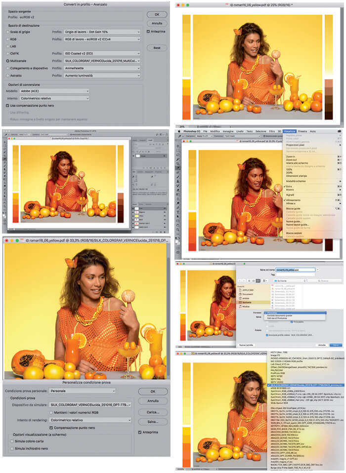
How to draw the maximum benefit from a color reproduction in extended gamut? Read HERE the Interview to Litoplas.


