The guide “Rotogravure: know it to better appreciate it” is a publication of the Italian Rotogravure Group, created in February last year within Acimga. In this article we take up salient parts of the chapter dedicated to color, written by Carlo Carnelli.
Ensuring a correct color reproduction, that is in accordance with the expectations of the designer and the client, and constant on all print runs, is one of the printer’s main concerns. The result, in fact, depends on so many factors that it represents a real difficulty, even for the “best” suppliers. These are subjective (the visual apparatus of each individual) and objective factors of various nature: related to the environment (typically, brightness) and the industrial reproduction process.
The guide “Rotogravure: know it to better appreciate it “published by the Italian Rotogravure Group of Acimga reviews them precisely, starting from the ABC of perception, going through prepress and listing the standards set and integrated over time by the CIE, which is the body responsible for the international recommendations for photometry and colorimetry.
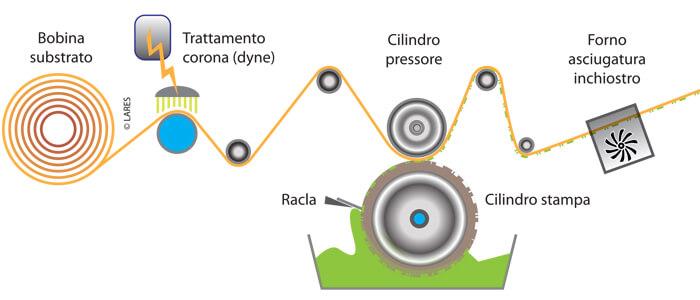
As the Guide clearly explains, the printing result depends not only on the correct setting of the parameters in prepress and on the respect of the standards but also, and considerably, on the concurrence of all the elements of the process: substrates and inks, of course, but also rollers, doctor blades, cylinders and pressers, the workflow and the characteristics of the machine itself. For this reason we could say, exaggerating for the sake of clarity, that obtaining a perfect color is more an ideal goal to be targeted by infinite approximations than a result achievable once and for all.
In this article we cite the chapters of the Guide dedicated to the studies carried out by the CIE with the aim of making definitions and quantities as objective (measurable) as possible. By giving “as read” the paragraphs on illuminants, objects and the observer himself, we refer to the methodology that enables the attainment of the values for color description.
The tristimulus values
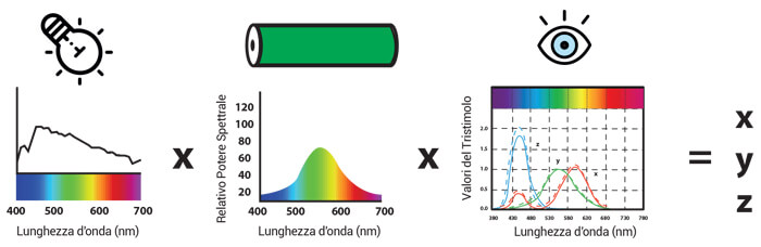
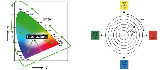
Once the numerical definition of illuminant, object and observer is attained, the next step consists in multiplying the three elements together to obtain the tristimulus xyz values, which numerically define a color and position it within a space (figure 1). These coordinates, after the CIE defined the standard observer in 1931, were used to form the chromaticity diagram in figure 2 and the commission recommended the use of the xyz chromatic coordinates […].
The chromaticity diagram, although very convenient and useful for practical purposes, is not very applicable to the industrial field because it is a not very uniform space, as it refers to the relative visibility of the eye. In fact, the color distribution does not have a homogeneous pattern for all wavelengths. As can be seen, the region dedicated to green is decidedly wider than that reserved for other colors. This creates a problem with regard to the determination of work tolerances.
The Yxy, after several studies, would be replaced in 1976 by two new chromatic diagrams or more commonly called color spaces:
- CIE 1976 (L * a * b *)
- CIELAB and CIELCH (L * C * h °)
These chromatic diagrams are based on the theory of opposing colors of vision, which says that two colors cannot be both green and red, nor blue and yellow at the same time.
As a result, individual values can be used to describe red/green and yellow/blue attributes.
CIELAB – 1976
The CIE L*a*b* Color space supports the theory of eye perception based on three separate receptors (red – green – blue). When the light reflected from an object strikes the receptors present in our eye, the latter are aroused and, as previously seen, three distinct signals are sent to our eye
- Light or dark
- Red or green
- Yellow or blue
These opposite colors were mathematically derived from the CIE values and defined in
1976 in the CIE L*a*b* with the aim of having a uniform space and color differences more conformant with the vision of the CIE 1931.
- L* is the measurement of the brightness of the object in a range that goes from 0 (black) to 100 (white)
- a* is the measure of red (a* positive) or green (a* negative)
- b* is the measure of yellow (b* positive) or blue (b* negative)
The closer the a* and b* coordinates are to zero, the more they indicate neutral colors (black, gray, white), the more they increase in value, the more the colors they refer to will be saturated.
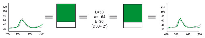
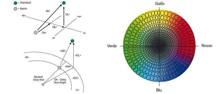
A color is uniquely defined with the three coordinates L* a* b*, provided it is accompanied by the indication of the illuminant and the observer angle with which it was observed (figure 3).
One of the most frequent errors when communicating color data in order to create it, is when L*a*b* values are provided without information about the illuminant or angle of observation. Without considering this information an L*a*b* value can correspond to different spectral curves (figure 4).
CIELCH
An alternative to L*a*b* is the numerical identification L*C*h*, which identifies the parameters of brightness, chroma (saturation) and hue. This system is based on CIELAB, but describes the position of the color using polar coordinates instead of rectangular ones.
- L* like for CIELAB, is the measurement of brightness of the object in a range that goes from 0 (black) to 100 (white).
- C* is the chroma measurement and represents the distance from the neutral axis.
- h* is the measure of the hue and is represented by a range of angles going from 0 to 360 degrees.
The angles between 0 and 90 represent the red – orange – yellow colors. The yellows, yellow-greens and greens instead range from 90 to 180 degrees; cyan (blues-greens) and the blues range from 180 to 270 degrees and lastly blue, purple and magenta range from 270 to 360 degrees, to return to the reds.
Color differences
The difference expressed numerically between a reference target and the analyzed sample is commonly called Delta. The deltas between two colorimetric coordinates can be positive or negative, and depending on the sign, the type of difference is determined.
- ∆L * = difference in brightness value; if the sign is positive the color is lighter, if the sign is negative the color is darker.
- ∆a * = difference on the red/green axis; if the sign is positive the color is more red, if the sign is negative the color is greener.
- ∆b * = difference on the yellow/blue axis; if the sign is positive the color is more yellow, if the sign is negative the color is bluer.
- ∆C * = chroma difference; if the sign is positive the color is more saturated, if the sign is negative the color is less saturated.
For ∆h it is necessary to introduce an exception because the simple change of the hue angle is not significant: the saturation of the two analyzed objects must be considered. For example, the same change of ∆h can be unnoticeable on two neutral colors at low saturation and very visible on a pair of very saturated colors, so normally the changes of hue are expressed with ∆H (and not ∆h), which represents the long distance in the arch of the Chroma. Therefore, for a similar hue angle difference the ∆H is greater between a pair of saturated colors than a pair of neutral colors. If the ∆H is negative it means that the analyzed sample is positioned clockwise on the the color space with respect to the standard, if positive it is positioned in an anticlockwise direction (figure 5).
Delta E
With the parameters analyzed above, it is possible to identify the difference on a specific axis, but to identify the total difference between the target and the analyzed sample one must refer to the difference in color space of the two samples. This difference is called ∆E: a single value that is always positive and expresses the value (size) of the difference, while not revealing whether the two colors are different. For example, two analyzed samples may have the same ∆E compared to the standard, but one may be lighter and the other darker.
Delta E is commonly used to specify tolerances. A unique value simplifies the operations of acceptance or rejection of a specific production, therefore it is necessary to pay a lot of attention to the type of Delta E used as there is more than one formula to indicate the value ∆E.
The non-symmetrical perception of color
Human vision perceives color differences unevenly, perceiving color variations (red becomes more yellow or more magenta) more than saturation variations (red is more or less saturated) and changes in brightness (color is lighter or darker). The perception of the difference also depends on the type of color. It has been observed that the perception of differences is more precise between achromatic (gray) colors than the perception of the same differences on saturated colors. Even between saturated colors of different hues perceptions of differences are not the same. For example, the human eye perceives differences between the greens less than those between oranges. Comparing this data to the ∆E developed on the basis of CIELAB 1976, it is defined that equivalent values do not necessarily correspond to identical visual differences.
Scholars have therefore immediately looked for a method to describe the chromatic differences in accordance with our perception of color. The evolutions of the DELTA E formula are articulated and here we will focus on the two main versions (figure 5).
CMC
The CMC is an equation that represents the color difference developed in 1984 by the ‘Color Measurement Committee of the society of dyers and coloristic’ to distinguish suitable colors from unsuitable ones in the textile world. Given the revolutionary scope of such an equation, it was soon used by other product sectors, including the world of graphic arts and flexible packaging.
The CMC equation has been derived from that connected to CIELAB and is based on luminosity, chroma and color hue (L, C, h). This change provides a numerical value ∆Ecmc that describes the difference between a target and a sample in a more uniform color space to sight, thus implementing the possibility of using this as the sole control point. This single value represents the volume of the ellipsoid of acceptability of the color around the target. The ellipsoid changes in shape and size depending on the position of the target color within the color space. An example of this change is represented by the graph shown here, in which we note how the size and shape of an ∆Ecmc of 1.0 changes according to the arrangement on the CIELAB space (figure 6).
Furthermore, the equation allows the user to change the size of the ellipsoid to define a better correlation with the vision of the analyzed samples; in fact the CMC formula outlines what is defined as the ratio between 1:C, parameters that can be varied to give a different weight to changes in brightness or chroma.
The CMC suggests the use of the 1:1 ratio for the evaluation of perceptible differences, and the 2:1 ratio or judging acceptable color differences.
The CMC 2:1 is still the most used method in rotogravure in Italy and in southern Europe, but with reasons linked to custom rather than for technical advantages.
CIEDE2000
The evolution of the formulas for the calculation of color differences is always due to the continuous need to fill the non-uniformity of color spaces defined in 1976 with visual coherence.
The CIEDE2000 formula introduces various corrections and is used for small color differences in reference conditions. Among the improvements introduced in the calculation there are, in addition to the dependence on brightness, chroma and hue:
- the introduction of weight functions: SL, SC, SH;
- the introduction of parametric factors: KL, KC and KH as corrections that take into account the influence of experimental display conditions;
- a localized modification of the scaling along the a* (red-green) axis to enhance the agreement with the perception of visual color difference for neutral colors;
- a function that improves and adjusts the color difference and the difference in shade in the blue region.
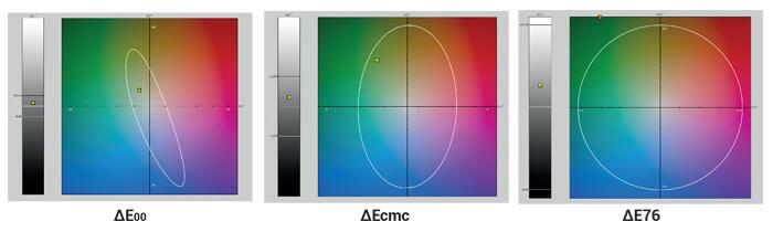
Numerous studies indicate that 2000E2000 is superior to other color differentiation formulas. From the experiments conducted over the years, it is clear that it corresponds better to the way in which human observers perceive small differences in color. Given a series of imperfections due to the experimental data on which it is based, the CIEDE2000 formula may not be the definitive answer for the investigation of chromatic differences. However, at the present time, the formula represents the latest evolution in the field and for this reason, since 2013, ISO has adopted AE2000 as the new industry standard for calculating color differences (figure 7). A standard also strongly advocated here.


