An “educated” R&D model implemented by Eurostampa in collaboration with a group of top machines, materials and consumables suppliers (here with Sun Chemicals). To dialogue with big brand designers and marketers, and develop the stimuli brought by the students of the University of Pollenzo, involved in a fruitful competition of ideas. With results that leave you speechless.
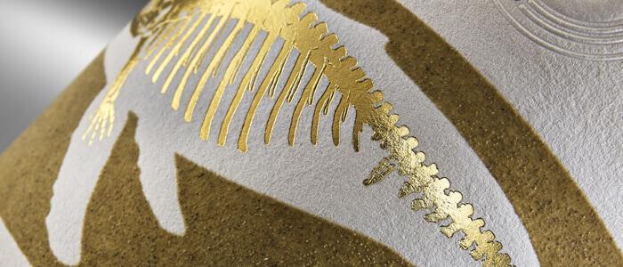
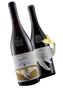
A whale skeleton lies under the surface of the vineyard worked so the soil might give nourishment, revealing that, geological ages ago, instead of that field, the sea once covered the area. The precious label that reproduces the scene, with the aid of hitherto unused techniques, thus opens up to the dimension of History and stories, stimulating not only the 5 physical senses but also the sixth sense of emotions and imagination – the most powerful of all, thanks to which that Barolo (with the Balena brand, by Michele Chiarlo) will not be forgotten.
Change the label and the scenario changes with it: we are in an exclusive club where a company of friends party and drink champagne. The Moët Chandon bottle shines in the dark when the “selfie” flash is fired, releasing luminescent effects that surprise and underline the uniqueness of a brand that is not for everyone.
They are two emblematic creations of the savoir fair of Eurostampa, one of the most important labeling companies in Italy, renowned for luxury and special projects – two examples of what can arise from the collaboration between culture and technology. The whole chain is involved, without exception: the cellars (brand); the designers; marketing, R&D and printer technicians; the suppliers of technology and consumables with, in both the aforementioned works, the Sun Chemical inks and varnish specialists taking pride of place.
And, in the background but not too much so, the partnership with the University of Gastronomic Sciences of Pollenzo (UNISGs), which gives life to a prolific exchange of knowledge and resources in which food culture and the territory meet the technological skills and crafts without which ideas could not be embodied in products, fecundating the pop culture par excellence: that of consumption.
Roots in the ground and head in the Clouds
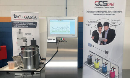
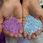
Paolo Caiani, Technical Director SF INKS + UV & Screen Sun Chemical Italia, gives an account: «At the beginning of the year Eurostampa had 50 kilos of soil from the Langhe sent to us, that we have “worked” to make the laboratory sample and be able to “print” it on a very precious label for a big brand Barolo. To say that it has been challenging is an understatement. The earth, which was obviously damp, was dried, sifted and ground to find the right fraction to be incorporated into the varnish that we proposed as a base, in a work of subsequent adjustments until an optimal result was obtained. And amazingly the label, finished and decorated with this original varnish, which our customer screenprinted, made its appearance at the last Vinitaly on a bottle of Barolo Chiarlo, and since then has won award after award».
«With this unique and striking label, Chiarlo tells the consumer a true story, that of the discovery of a whale fossil in one of his vineyards. He does this by fielding the graphics of Mario di Paolo and the Kurz-Luxoro gold foils at the service of a sophisticated living story that breaks the communication patterns of a traditionalist sector such as that of Piedmontese fine wines.»
«It is no coincidence that living (hi)story represents one of the contents of our Trends Cloud. This is the name we have given to the virtual container of the great trends that inspire us in identifying new labeling solutions. This includes sustainability, increasingly felt and “urgent”, an increasingly extreme personalization (after the 7 million sleeves created with HP’s Mosaic for Nutella Unica, on the occasion of this latest Champion’s League, Eurostampa produced 63 million different labels for Heineken, Ed.) and what we called “bright ideas” and inspired the design of another very special label, which we made for Moët & Chandon … »
Shine in the Black Light
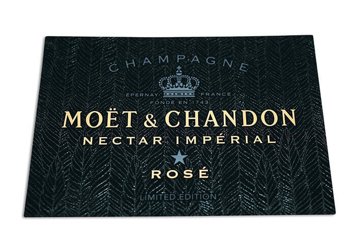
More technological and equally surprising are the ingredients used for Moët & Chandon Nero by Public School. Starting point: the product consumption channels – clubs, discos, night clubs frequented by young people who want to have fun and where taking a “selfie” holding a bottle of champagne of a great brand gives a real buzz. «From here the idea was born to create a label with luminous effects that amplifies the party effect – Sauvaigne explains – here too done with the aid of Sun Chemical. A varnish was created with reflective effects that are activated by the flash of the mobile phone, illuminating the designs of the label in the dark with a certain WOW effect».
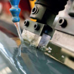
«The focal point – says Caiani – here is given by a reflective pigment that lights up in the event of radiation, added to a UV screen printing varnish. Here too, as in most finishing and decorating operations, screen printing is the only choice, due to the size of the pigment particles, unmanageable with offset, screen printing also being feasible because normally such special jobs have print runs limited to a few thousand units. Provided that the specific problems of speed and machineabiliy are overcome, with the continuous support of Eurostampa technicians: together we develop the idea at laboratory level; then the samplings are carried out that highlight the product’s limits in the realization phase; this is followedby the adjustment phase, that enables the limits to be overcome or that imposes the revision of the project. It is a work of close collaboration, of an interdisciplinary type, which continues until the product has been perfected, creating real innovation where everyone always learns something.»
[su_box title=”Nel LAB(els) the R&S is collaborative” style=”glass” box_color=”#e6000a” radius=”5″]
Eurostampa is a group that draws its roots in the hills of Cuneo’s “great province” having branches in areas of Europe and America with a high vocation in wine and spirits production. Wines and spirits represent the main outlet sectors of its products, often veritable top creations of the difficult art of finishing and decorating, where a stateof- the-art machine park for screen printing, offset, flexo and digital, technologies and the most advanced materials is brought to bear. Together with its suppliers the Piedmontese label maker develops the new and challenging products demanded by the big brands and that their creatives manage to conjure up: their collaboration is essential and to facilitate it in the very modern head office of Bene Vagienna an “ideas laboratory” called Innovation LABels has been active for a couple of years. Brainchild of Riccardo Sauvaigne himself, who acts as a liaison with the company’s industrial and “cultural” partners (Pollenzo University in first place), and who, not by chance is head of marketing and innovation: a special combination, emblematic of the corporate mindset, where product culture and technology compliment each other. On the walls of the LAB, a small exhibition of the elements that contribute to transforming ideas into products, presented by the suppliers that Eurostampa has chosen as partners of excellence: Avery Dennison (substrates), Luxoro-Leonhard Kurz (foils, clichés and equipment), Sun Chemical (inks, lacquers, varnishes), Heidelberg Italia (offset printing machines), HP (digital printing machines) and Esko (prepress). Their specialists meet here to talk to creatives about their increasingly challenging projects, exchange technical information, compare trials and test results, adjust their aim or persevere until the optimum result is achieved – with the involvement of the Eurostampa marketers, engineers and printers. And the results are much more than the sum of the parts.
[/su_box]
The book, the vegetable garden, the woman: Young people’s labels
The most glaring example of Eurostampa’s ability to collaborate involves the UNISG of Pollenzo (and this year also the College of Design, Architecture, Art, and Planning of the University of Cincinnati) and takes the form of the competition of ideas for labels.
It is called Envelope and the third edition, dated 2019, was presented at the end of June in collaboration with the technological partners during the event “Coltivare e Custodire” of the Ceretto Wine Companies.
The procedure is simple: a committee identifies a theme, the students represent it through an artistic elaboration and a text, the experts select the 6 best rated sketches and transform them (with the direct aid of Jessica Liffredo (Design Director) into labels with a strong ethical and aesthetic impact, enhanced by the use of innovative materials and technologies.
The results, however, are rich and sophisticated. As Riccardo Sauvaigne emphasizes «in the student’s work the sensitivity, the aesthetic orientations and the values of the new generations converge, every year giving life to a collection of labels that testify to the innovative capacity of our partners. Here the cultural content is particularly evident: the boys are very sensitive and free on the graphic-visual level, but their reactions also always contain a message, and this is what gives them value. In their sketches that little piece of paper of 7 cm x 10 becomes a whole world of symbols, meanings and techniques, which has the same completeness and perfection as the hortus conclusus of medieval monks, the rector of Pollenzo suggests in the biography written for 50 years of Eurostampa.
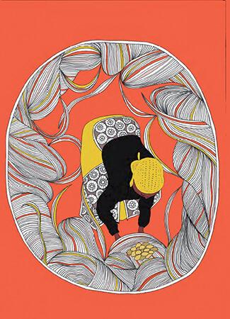
«In 2018 the theme of the contest was “The vegetable garden revolution” and was inspired by the famous quote by Cicero “If you have the vegetable garden next to the library, you lack nothing”», Liffredo tells us. «Their projects are also challenging on a technical level. They fielded “sympathetic” inks that appear when irradiated by a Wood lamp and thermochromic touch sensitive ones that react to the heat of the hand (both Sun Chemical). In terms of graphics they joyfully play with a nice mix of visual cultures from around the world, and break the barriers between expressive instruments: inspired by Cicero’s sentence a student started out from a particularly elegant cellulose formula to highlight the chain of relationships between paper (books), trees, vegetable garden and nature, where the chemical formula has become a decoration. It was the basis for creating a label for refreshing drinks, with functional thermochromic elements, and an Envelope personalised with the HP Mosaic.»
Nor is the theme of this year’s competition entitled “Women: regenerating food, regenerating earth ”any less committal .. At the center, a couple of themes that are very important to young people: the environment and woman, who is expected to play an evermore active role, and to which one looks with hope. A bearer of life, many projects seem to say, who will then be able to preserve the same….
Now once again it is up to Eurostampa technicians to create them, with the support of suppliers. The knowhow is there, stresses Sauvaigne: «We have been printing the most arduous projects for over 50 years, with the most innovative machines (on which we often do the beta tests), on the most incredible materials. It is thanks to this that we have developed unique skills».


