
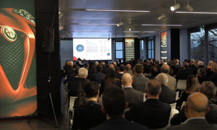
It might be that participating in live events has assumed a different value after the pandemic, but if in addition to the pleasure of meeting in person you can add a high-level technical content, then the event becomes a sure success. And so it was for the recent TAGA Day 2023 in Milan.
by Stefano d’Andrea
Taga Day is back in attendance with lots of content and great audience participation. The ritual openings, entrusted to Father Alessandro Ticozzi, director of the Salesiani Don Bosco institute that hosted the event for free (remembering that not only the professional training but also the first apprenticeship contract was due to Don Bosco), to David Serenelli and Alessandro Mambretti, respectively secretary and president of TAGA Italia, underlined the importance to base work training and education on ethical and moral foundations and the task of the graphic training school because “it is from the foundations that buildings are built”.
Technical sessions on the theme of spot colour management followed one another, touching all phases of the flow of graphic processing: from design, to pre-press , through ink formulation and finally to quality control on the printed result.
Choose the colour
Luca Morandi immediately touched on a particularly current topic: the use and evolution of Pantone® libraries in graphic application programs. As of November 2022, Adobe’s in-software libraries are limited to the Pantone®+ CMYK Coated, Uncoated, and Metallics versions only. The other libraries are available only with the purchase of the Pantone®® Connect plugin, which offers all complete and updated libraries, including those for sectors not strictly graphic, such as textiles, and the most complete colour description, with values reported in all formats useful for graphic design, including L*a*b* values, always measured in M2 (with UV filter) but now finally more accurate at 2 decimal digits. It is important to remember that Pantone® itself recommends considering its products exactly as the name suggests: Formula Guide, therefore as a guide, not certainly as a standard reference. We also must take into account that the ink composition formulas refer to offset inks and are not to be considered in the case of flexographic, rotogravure or other printing processes that can use different bases, in different quantities and on different substrates. The Pantone® colour reference is therefore not a standard to be used for colour communication as it does not provide guarantees for an unambiguous communication. Although since 2010 the guide implements digital data, the L*a*b* values are not sufficient because information on the illuminant (e.g. D50), the observer (e.g. 2°) and measurement conditions are missing. To solve these limitations and correctly communicate the characteristics of the colour we have the CxF format, of which Carlo Carnelli has provided the complete explanation here below.
Communicate color
The CxF (Color Exchange Format) was established in 2001 by Gretag Macbeth in order to have a method of communicating the characteristics of spot colours between different tools and softwares. Soon the developers realized the potential of this system and gave up the intellectual property to allow it to become an international standard format, regulated by ISO 17972. The CxF can contain information relating to one or more colour objects, that is, different colours or the same colour under different measurement conditions, starting from the spectral data. The file is a container that also conveys the expected tolerances in colour differences in reproduction, illuminant specifications, the standard observer and the method for calculating the L* a * b* values from spectral data. The information can cover any colour descriptive need, such as -for example- the way in which the data were acquired, the geometry of the instrument, the reading diameter, the substrate (black/white backing) the spot or scan reading, and much more up to the serial code of the instrument used. So the CxF is able to contain extremely specific and detailed definitions of all parameters necessary for the description of the colour. The original format has evolved and has been refined over the years, until we got to the CxF/X-4 in 2018, which provides 3 modes and as many levels of precision in colour description:
- CxF/X-4b: solid colour only
- CxF/X-4a: solid color and its halftones (minimum 3 up to 11, every 10%) on substrate
- CxF/X-4: solid color and its halftones on both substrate and black to evaluate the behaviour in case of overprinting with other colours.
The latter is therefore the most complete format to manage the colour and simulate its behaviour on digital colour-proofing systems, or to be able to import the data into the spectrophotometer used to control the printing process, including the tolerances expected in production. Finally, it is essential to provide all necessary data to the ink kitchen for the formulation of spot colours inks for the pressroom.
Handle spot colors with CxF inside PDF
Finally, one can embed a CxF file into a PDF file to complete a graphic project with detailed information about the colour to be reproduced. Denis Salicetti went into the substance and illustrated, with different tools available on the market, how these operations can be carried out to ensure the best management of special colours. Unfortunately, at the moment the information contained in a CxF is not yet fully usable in graphics programs: it is not possible to display a reliable result of overprints and tonal shades in halftones, while waiting for the latest PDF 2.0 and PDF/X-6 formats to be supported. Colour values in the CxF may differ from those used in the workflow, such as L* a * b* in M2 values in the graphic, ink formulation in M0, and quality control in M1: attention must therefore be paid to the consistency of colorimetric values throughout the process.
More on spot colors
How to manage spot colours in printing systems that use fixed palettes and do not have special colours? Enrico Galli made practical examples on digital toner and ink-jet printing. Here the correct characterization of the system, typically represented by a CMYK ICC profile, is essential to convert the required spot colour appropriately.The use of CxF in this context is very convenient because this “container” of information can also convey the expected tolerances and this data can be used to obtain consistent and predictable results even at printing plants located in different geographical locations.
From theory to practice: preparing the ink
At this point the actual preparation of the ink to be loaded into the printing press must take place, and Piero Pozzi explained why the CxF is the ideal format for this fundamental phase of the process. The comparison between the colours printed on two Pantone® swatch-books from 2022 and 2023 and the respective values in the digital library confirm that the function of the guides is precisely to provide a mere indication that can predict colour differences greater than 5 ΔE₀₀ (see graph). Followed a demonstration with some practical examples of measurement and control using the two most popular tools on the market and their software, accompanied by a step-by-step explanation of the flow of operations and analysis of the results obtained.
From theory to practice: the measurement conditions
With the last technical contribution, Luca Morandi clarified something mentioned a number of times during the day and often not completely understood by users: measurement conditions. Introduced in 2009 and subsequently confirmed in ISO 13655:2017, they describe the specifications of the light source (the device that physically illuminates the sample to be analysed), the standard illuminant and the observer angle, and are marked with the letter M and a distinctive number. The necessity to specify these different conditions arises from the need to manage the presence of fluorescent substances in printing substrates and inks. These substances, called “optical brightening agents” (OBA) are able to capture energy in the ultraviolet range and transform it into blue light, increasing the brightness of the substrate and modifying the spectral response of the measured colour.The M0 condition can be used when the presence of OBA (evaluable after spectrophotometric measurement) has been ruled out, typically in opaque or transparent plastic substrates. The M1 condition must be used in the presence of OBA and allows its correct management. The M2 condition uses a filter to ignore the ultraviolet region, so as not to handle it during measurement. The M3 condition uses a polarizing filter, which also has UV filter functions, and should be used when the ink layer presents differences between the condition just after printing and after a drying period, such as in offset printing.
The TAGA Lab is treated with Paracetacolor
The day ended with the analysis of a graphic work specifically designed to collect information on how the spot colours described by the digital data are managed in everyday practice. Students of the ITS Rizzoli packaging course were involved in the design of the layout of a drug box, by the playful name of Paracetacolour, which provides for spot-colour printing only: two colours as specified by the Pantone® library in the graphic software, and one colour defined by external specification attached in CxF format. The graphic material was made available to registered TAGA Day attendees, who were requested to print it according to the methods in use in order to verify how these processes are managed and evaluate the results together. The proposed activity was obviously not a contest but rather a shared validation, with the aim of stimulating participation and comparison, and it really demonstrated how important the spirit of collaboration and sharing that characterizes the activities of TAGA Italia is.
Conclusions
In conclusion, it was an interesting and highly participated TAGA Day, complete in information and effective in the content the participants were able to bring home. The reproduction of colours with different printing technologies requires knowledge of the characteristics of these systems and the sharing of methods and procedures with all actors in the supply chain. Colour reproduction is not a request to be fulfilled by chasing after a result, but the result of a structured and carefully controlled process. The world of creativity and graphic design has a strong need to receive information on system characteristics and reproducibility limits from the press and pre-press. The tools available to the normal non-professional user who designs graphics for printing still do not allow for a sufficiently realistic preview of the result to be correctly evaluated “on screen”, but there are solutions available to solve these limits and we expect news in this regards. The hope is that it will soon be possible to share more and more information between end customers, graphic designers, pre-press and printing for a correct management of the graphic process and to meet needs and expectations on the product within the limits and characteristics of the production systems, for the best satisfaction in the making of printed packaging.


