In this issue of Converting the Color Academy features in the “InDepth” section with a technical lesson on why and how to print in six colors. With an original appendix: the results of a test, done while actually carrying out work, to compare the effectiveness and limitations of the Fogra 51 four-color with an original hexachrome process.
Di Andrea De Rossi
As the words suggest hexachrome is a printing reproduction technique that uses 6 colors instead of the 4 used in the four-color process. The addition of two special colors increases the color gamut of reproducible colors in offset, flexography, digital etc. Compared to the four-color process, with hexachrome an increase of up to 40% in the volume of the ICC profile can be achieved. The two special colors that are normally added are Orange and Blue. These two colors are preferentially used outside the scale, because Magenta is the most contaminated (least pure) of the quadrichrome process colors, hence having a high grade of gray. Thus the chromatic compositions comprising Magenta (i.e. Orange: Yellow + Magenta; Blue: Cyan + Magenta) always appear dirty in print and with dull hues. The use of mono-pigmented “solid” inks such as Orange and Blue ensures clean, transparent and bright shades of color that are closer to a RGB rendering. Hexachrome is not to be confused with processes that use CMYK colors to which “spot” colors are added for backgrounds or non raster vector graphics. In hexachrome as many as 6 screened colors contribute to the formation of the image and of all the other chromatic compositions of the file.
Why is hexachrome important?
Because it’s the future of printing, a new business development opportunity! Market projections predict that hexachrome in the next three to five years will constitute 50% of all printing production in the paper industry and in packaging, labels, flexible packaging and tin casings. The printing processes involved are offset, flexo, rotogravure and digital. In fact, with only six colors it will be possible to reproduce roughly over 80% of the mixtures of special colors proposed by the most widespread and known color atlases. This percentage rises to around 85% if a seventh color is added (i.e. Green).

Colorimetric values of primary and secondary colors.
Why is hexachrome inexpensive?
Because it allows a greater production yield and a better exploitation of the plates. The indiscriminate use of spot color has led to a huge increase in production costs in many print processes. Many orders require additional special colors selected from catalogues that offer a choice of over 1,500 different colors. In addition to the technical difficulty of accurately formulating ink recipes, there is the economic disadvantage of having to completely wash (… and re-wash) the printing press color units with each new job (imposition proofing) which involves the use of special inks different to those used in the previous run. In some processes, machine downtime for washing and color change accounts for approximately 50% of the unproductive hours out of the total of the workable hours. Hexachrome printing allows you to always have the same fixed (machine fresh) inks in each printing unit and always ready as a sequence for many different production orders.
Why is hexachrome eco-sustainable?
Because the polluting materials and waste are reduced, hence leading to “greener” printing. Hexachrome is an eco-sustainable process as it drastically reduces the number of washes in the press where huge amounts of volatile solvents are used. The storage and the leftovers of special inks often in fact constitute a substantial economic immobilisation and they often have to be disposed of with additional costs, because they tend to expire before their reuse (especially in the case of UV inks). Furthermore, the recovery of production surpluses encourages grouping and mixing of special inks, whose “strange mixtures” are the main cause of unforeseen events and metameric effects that make the same colors unreproducible in the event of a new reprint. Summing up: six-color printing ensures less waste during makeready, less polluting products for the environment, less waste during the print run, greater production savings, higher profit margins and better prices for the end customer.
Why is hexachrome possible today?
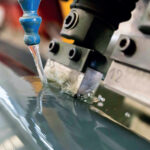
Because the technology is mature and guarantees results. There have been two technical limitations that have slowed down the development of the hexachrome in the past. The applications usually used by graphic designers, creative talents and pre-press technicians only manage the four-color process. Some multichannel systems were not yet performant and a color management was needed that could better manage vector graphic elements, images and especially the different PDF file formats. The introduction to the market of advanced, professional and easy-to-use Smart Color Management systems, such as those of ColorLogic, have enabled the application of hexachromy and heptachromy. ColorLogic Multichannel software (CMYK +3 spot colors), thanks to CoPra and ZePra applications, enables the easy creation of Multicolor Device Link profiles capable of generating multichannel chromatic separations: pentachrome, hexachrome and heptachrome. The limits of prepress in the preparation of all types of files are hence totally lifted. A second limit concerned the production of print forms. In fact, not all the production systems for offset printing forms (plates) or polymers (clichés) for flexo, have digital CTP devices able to generate third generation FM stochastic (frequency modulation) geometries. The use of AM (amplitude modulation) screens with the classic inclinations have a potential moiré risk because you have to assign one of the inclinations already prerogative of the four-color process to the additional colors. For example, by assigning to Blue the same inclination as Magenta, to Green that of Cyan and to the Orange that of Yellow one risks optical interferences also generated by minimal movements of the paper and poor register. FM (stochastic) screening available for offset, flexo and digital printing technologies allows the use of multichannel with 5, 6, 7 and more colors, without any problems.
Does printing in hexachrome present any limits?
Every printing process has its advantages and disadvantages. It is simply a matter of assessing whether the economic entity of the advantages gained are such as to suggest a change of “problem solving” mentality and culture that directs the entrepreneur towards the minimization of technical limits through a new organizational approach. For example, if you want a small text character or a barcode (positive or negative) in the color purple, you might prefer to use only one spot color to avoid the risk of off-register of the 2 or more overlapping colors needed to compose the color: for example Magenta plus Blue, or Magenta plus Cyan plus Black. Adding a special color gives more security in printing but generates more costs. However, this aspect should not be considered an insurmountable limit of hexachrome, because it is enough to design the printing system with only one color of the 6 available. Certainly the designer’s “chromatic fantasy” must be limited to guarantee the technical result desired. However, if printing presses are efficient and keep register, there is no problem in composing small graphic elements with more than one color. Digital printing, due to its technical characteristics, avoids the risk of off-register. Just think of the print accuracy of an Epson inkjet that uses 11 colors.
A test that clarifies many things
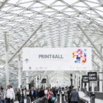
This is a technical report of an original work, presented at the Tecnologie Grafiche stand during Print4All. It demonstrates how images taken from databases are easily and automatically converted from RGB to four-color Fogra 51 and into hexachrome CMYK+O+B. With a series of pros and cons.
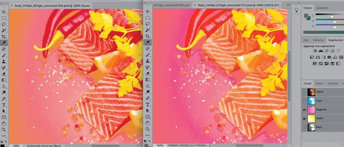
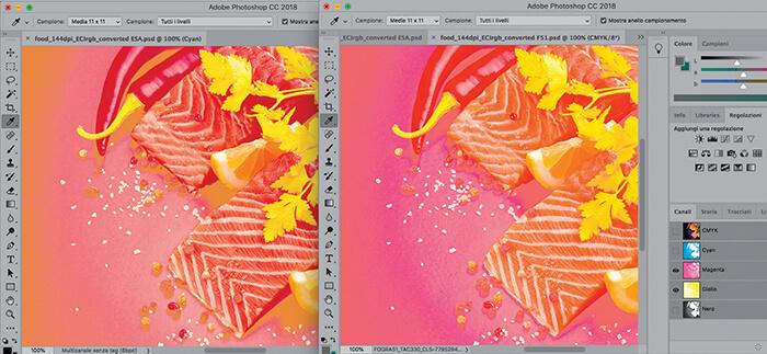
Premise: in order to appreciate this study one needs to understand how the “hexachrome test” printout is to be observed and evaluated. When the sheet is folded and trimmed, for the same subject, the images on the left are those in four-color with standard Fogra 51, while those on the right have been done in hexachrome. The printing was done in Fogra 51 so that the paper colorimetry complies perfectly with ISO 12647-2: 2013 specifications. All RGB files were resampled at 144 dpi resolution. The PDF of a 16 page imposition on 70×100 maximum paper size is only 6MB. The small dimensions enable maximum file transmission speed as well as maximum efficiency in management, meaning that ever faster computers and huge mass storage are not required. File transmission is easy and can be done with a simple email attachment. A dynamic Savink strategy with a maximum TAC of about 250% was applied to the Fogra 51 images. The hexachrome has been devised with 300% color TAC and 270% black TAC. Even with such low TAC values, the possibility of obtaining an excellent printed result has been demonstrated. The TAC applied is very low because a TAC of 350 is normally applied. We saved 15% of ink, using the same TAC of an ISO Coated 300V2 four-color profile based on Fogra 39 characterization.
[su_box title=”Operative phases (with the instruments advised by the author) ” box_color=”#e6000a” radius=”5″]
[su_list icon=”icon: arrow-circle-o-right” icon_color=”#e6000a”]
- Optimization of the printing machine or set with the adjustment of the rebates of the dampening and inking rollers. Check on rubber, coatings and dampening
- Choosing a paper compatible with the Fogra 51 standard
- Evaluating, understanding and eventually correcting the color of the images in the hues that need to be enhanced: Red, Green, Blue
- Choosing two “solid” special inks, possibly mono pigmented and “fresh in the machine”, with a colorimetry able to extend the gamut to the typical colors of the files to be printed: in our case Orange (O) + Blue (B).
- Linearization of the printing forms (CTP plates) with FM screening by checking with Techkon SpectroPlate camera.
- Printing the Test Form of FT1-ECSA- Easy Calibration-Speed ApplicationTM of Tecnologie Grafiche with O-CMYK-B sequence.
- The placement of CMYK in the press is in units 2-3-4-5. The first unit is kept free for the passage of “blank” paper in order to eliminate the dust of the coating. Unit 6 is intended for special colors. In order to avoid costly washes, it was decided to place the Orange in unit 1, because the ink is opaque.
- Printing the four-color process with density complying with the colorimetry expected for Fogra 51. Print O + B with colorimetry whose L* guarantees brightness and color purity: do not saturate too much so as not to lose transparency in favor of opacity. For example: if Blue 072 has L* 17, better L * 24; if Orange 021 has C * …, better C *.
- Measuring the colorimetry with Measurement Method M1 with Techkon Spectro- Dens.
- Computing the compensation curves to ensure the TVY 16 over 50% for CMYK and for Orange and Blue with TVI Linear Colorimetrics compliant with ISO 20654 using the Techkon Spectro Connect software.
- Printing the Characterization Test Form with FT2-CL2740TM of Tecnologie Grafiche with gradation processed in ZePra of ColorLogic with the same density and colorimetry with which the FT1 was printed.
- Measurement of the Multichannel Color Targets with the Barbieri Spectro LFPqb spectrophotometer, compliant with ISO 13655: 2017 and measurement method M1 part 1 (also for fluorescent inks).
- Optimization of the characterization file with ColorLogic – ColorAnt “L” to improve data quality.
- Creation of a hexachromatic multichannel ICC profile with a TAC of no more than 350 with ColorLogic CoPra XXL.
- Normalize with ECIrgb v4 profile all files that contain color images whether they are .TIF or .PDF and convert them with “Multichannel 6-color profile” using a Color Management strategy based on Device Link technology, thanks to ZePra: the ColorLogic Smart Color Server.
- Page the PDF files with “Multichannel 6-color profile” output intent in a Custom Test Form. If need be use one of the Graphic Technologies Test Forms: FT3_Esaprint_OB, FT3_Esaprint_OG, FT3 Eptaprint OGB.
- Print the Esaprint_OB Test Form FT3_with the same density and colorimetry with which the FT1 and FT2 forms were printed.
[/su_list]
[/su_box]
Technical and critical observations
With this test we wanted to demonstrate how images taken from databases, without any kind of chromatic intervention, taken just as they are, can be easily and automatically converted from RGB to four-color Fogra 51 and hexachrome CMYK+O+B, with an automatic flow. The result is generally appreciable, even if for some files appropriate correction in the medium to maximum tones are needed. Some color inversions are due to three basic reasons:
- The characterization was only based on the 78 notches of the new edition of the Fogra-Mediawedge Multicolor V1 scale. The lack of in-formation denotes a flattening of some critical tones, in particular in the medium to maximum tones. The criticality is obvious: the medium to maximum tones have the greatest amount of color and ink overlap and the characterization file is poor on information in the medium to maximum and maximum tones.
- The printing was done with a high difficulty coefficient: 6 FM channels (20 micron stochastic screen). Normally this type of work is carried out with four-color process in AM (classic screen) and the spot colors with the FM screen.
- To avoid the printer who hosted us having to do senseless machine washes, we applied an unusual sequence: Orange-K-C-M-Y-Blue. The orange (the most opaque) in prime position has prevented its possible “floating” if it were printed in the fifth print unit. We did not apply the calculation of opacity and transparency in the conversion system. This can be remedied by setting an appropriate multichannel calculation algorithm that takes into account custom sequences induced by economic choices, even prior to technical ones.
One also needs to consider two other premises:
- Hexachrome printing requires a perfectly optimized printing press with perfect damping. The printing criticalities associated with emulsification increase by 50% due to the presence of two other colors which, moreover, are special hues that do not mix well with the four-color process.
- In order to have the maximum color rendering an excessive amount of ink should not be used in order to simulate the LAB values of the corresponding spot colors, even if visually, high saturations are more appreciated. It should be remembered that the additional colors are then added to the four-color process and thus lighter L* values (L*+4 for Orange and Blue) turn out to be convenient.
On the left we see the three channels M + Y + Orange and to the right, for the Fogra 51, the M + Y. The color power (saturation) of the multichannel on the left is due to the addition of the Orange. Note, in particular, the three-dimensionality of the lemon wedge.
Critical analysis of the printed images
- The files that contain highly saturated hues are better suited to hexachrome conversions. The power of the color, the cleanliness and transparency emerge immediately.
- Solid color backgrounds confirm that hexachrome is very effective for the paper&board industry, where it will certainly find its most technically appropriate area. Unlike what is believed, a mixture of several inks allows a greater corrective manoeuvre to compensate the white balance of the cardboard.
- All images containing color compositions akin to the special hues used (Orange and Blue) are obviously enhanced in vividness and are seen to be emotional.
- Current experience indicates that hexachrome is inappropriate for the achromatic images to be printed with K alone or in 4 colors or with duotones or tritones. We will obtain an extraordinary power and depth of composite black – for example as background, which appears very deep because it is rich in subcolor, despite having a density similar to that of the corresponding Fogra 51 image. Likewise a subject which has medium gray tones and low contrast, has its gray balance and color consistency improved, and above all sees an increase in the volume of detail.
- The synthesis of the chromatic powers of hexachrome finds its maximum expression in the“rainbow” color gradient and also in the famous Agfa-Fuji-Kodak test. In the hexachrome image the achromatic nuance is continuous, monochromatic without any deviation in hue, free from banding, demonstrating a perfect calculation of the TVI of the primary colors and SCTV of the Orange and Blue.
- In the pictures accompanying this article, the image of the “salmon” responds to the new chromatic tastes of television and broadcasting and visual posters. The three-dimensionality of the lemon, the pepper and the parsley is surprising.
- An eventual “unexpected” chromatic power can be attributable to the rich color range of the original RGB file. Here chromatic correction is unavoidable.
Despite this, the vividness and saturation is incredible, giving a glimpse of the limits of the red color range, the graphics and the tonal shifts.

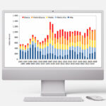
The new Fogra scales for the multicolor quality control at 5, 6, 7 and 8 colors.
The perception of observers
Those who observed and compared the two prints side by side, four-color and six-color, said that “the left-hand print (Fogra 51) is dead; while right hand one is alive!” We told many sector technicians that the sheet had two flaws. Nobody detected them except for two people.
My considerations
After presenting the test to a series of sector operators, I found that: – only a few people are able to analyse prints and even fewer are able to detect any possible flaws; – most people are impressed and excited by the vision of saturated, vivid, chromatically powerful three-dimensional images. Television with its realism and high definition has affected all users who today see, observe and evaluate images, using the television as a measure of judgement. If this is what the user judges as “beautiful”, printing must necessarily adapt to this benchmark. What little is still left of printing will therefore have to be able to at least render color and images with the quality of television, display systems and smart phones. This explains why the multicolor process that seemed to have been abandoned, will be much in vogue over the next 10 years and will remain up to when one is able to get an extended gamut only using the 4 CMYK print primaries, inasmuch as urged on by the continuous demands for cost reduction and sustainability. In fact, it will not be to most peoples’ liking, but it should be said that in order to survive, printing will have to cost less.


