Hybridization is certainly a sensitive topic in the labelling sector, increasingly influenced by interactions between different technologies. A DFTA research sheds light on technical aspects.
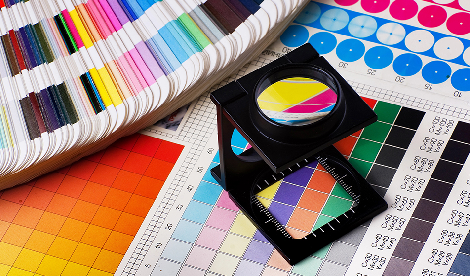
In the label printing sector, colour is not only an aesthetic value: it means identity, recognition and commercial impact. But maintaining colour consistency between different printing technologies is one of the toughest challenges, especially in hybrid environments combining flexo and digital printing. These two techniques, profoundly different in terms of materials, inks and transfer technique, must, however, produce a homogeneous visual result when used in the same production cycle – for example when managing main runs in flexo and rapid reprints with digital.
Structural differences affecting colour rendering
Flexo printing often relies on spot colours to achieve off-gamut CMYK colours or ensure absolute fidelity. These colours, printed as individual separations, may vary depending on the ink supplier. Digital printing, on the other hand, does not use physical spots, each colour is converted into its own fixed set of inks – often CMYK or 7 colours – with precise formulas managed by the machine manufacturer. This conversion involves complex work: colours must be modeled, simulated and adapted on the basis of the original spectral characteristics. Without accurate machine and substrate profiling (the so-called “colour fingerprint”), deviations can’t be avoided.
A technological heart: spectral management and predictive modeling
The whitepaper by DFTA emphasises how only spectral data can offer a unique representation of a colour, defining its identity as a sort of chromatic DNA. Modern colour management solutions use this data to create predictive models capable of simulating how a given spot color will appear once converted through digital processes. This approach is critical to faithfully simulate solid hues, halftones, and overprints. In particular, the application of the SCTV (Spot Color Tone Value) method, recognized at the ISO level, allows a uniform linearization of halftones, guaranteeing soft and consistent colours both in flexo and in digital.
The complexity of overprints and the concept of “flattening”
One of the greatest difficulties in hybrid printing concerns overprinting, that is, the optical combinations that are generated when two colors are printed one on top of the other. While in flexo this physical interaction between layers of ink is real, it must be simulated in digital printing. This requires a reduction process where overlapping colors are merged into a single object with the resulting color already calculated. Without this operation, even a perfect management of individual colors would not be enough: the final visual effect would still be incorrect.
DFTA search results: more data, fewer errors
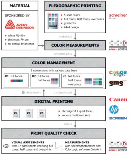
A study conducted by the DFTA’s AKDV working group showed how crucial the amount of data available to operators can be. Comparing three different levels of chromatic information – spot colours only (K1), spot colours and halftones (K2), and a combination of spot, halftones and overprints (K3) – it emerged that only the third scenario allowed to obtain a lower than 2.5 ΔE00, the commonly accepted limit for precise correspondence. When you only have spot colour data available, the conversion model must be based on – often inaccurate – assumptions. The use of professional software, however, can mitigate errors and still produce acceptable results.
Towards an advanced and informed colour management
The message is clear: in the world of labels, especially in hybrid scenarios, colour reproduction requires a technical, systematic and knowledgeable approach. It is essential to have access to complete spectral data, updated profiles, advanced calculation methods (such as SCTV), to a software capable of simulating and “flattening” files and, above all, to have a shared colour “culture” between operators, pre-press and end customers. Only in this way will it be possible to ensure that a label printed with flexo today will convey exactly the same visual sensation when it will be reprinted in digital tomorrow. And at the end of the day, in the packaging universe, colour does not allow for compromises.


